What makes a logo successful?
A company is known by its logo faster than by its name. In the 20th century, designers realized that logos should be clean, catchy, and easy to remember. That’s when brands turn their heads to simplicity. An effective logo should not only be simple and distinctive but also have a smart concept.
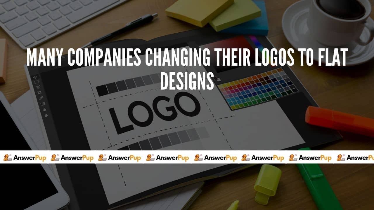
If you haven’t noticed yet that so many companies are switching the state of their logo to have a flat one.
Maybe they have to a flat one so this didn’t happen all of sudden in 2020. It has been happening since 2013.
Companies have to focus and contribute to the digital world. After rebranding with 3D chrome effect logos in the 80s and 90s. Carmakers from Nissan to BMW are reverting to flag design for logos to keep pace with the digital world.
It is because of ‘Apple’. Before ‘iOS 7’ was launched in 2013, everything was pseudo-3D means that designs were not in 3D but the image shadow and gradients were applied to make them look 3D but after iOS 7 was launched everything was changed to a flat new world. Starting from the user device of iOS changing to the flat, an application was forced to follow the trend.
The one that doesn’t follow the trend simply died.
Following this trend put forward by the tech gene apple, other companies follow the same which affected the momentum of the audible companies.
The flat design indicates simplicity and it is the main reason why companies were switching to it. The other reasons are the preservation of details, when you look at the 3D logo and scale it down to the size of an app icon, you’ll not going to be able to get the same details as you would get in the actual size of the logo. 3D logos have certain principles to be followed-
- First is the colour unlike flat logos you don’t have the freedom to use colours you prefer or you can’t apply different colours to the logos as it will not going to look good but flat designs provide felicity to all of these.
- Some of the major features like its trendy luck crossbow visuals reduced efforts in making the logo simplification of the logo flexibility to use it across multiple platforms
- Bold colour combinations can be used, details are easy to understand
- They can easily be enhanced in terms of UX and these logos are cost-effective to use.
In 1997, Google introduced its first logo. But after so much design they landed on a 3D logo. The design was all started in the early 2000s. When we searching the internet, we all scroll past a lot of the same logos and over again. The logos were used for mostly flat designs. They were simple, clean, and 2D. In this developing world companies realized how impactful symbols were. They started to put a lot more through into the design process.
Read Also: How do I start using Quora?
With the 1970s came CGI and from there, the logo started to come to life. But the development came at this time of Adobe developed in design and photoshop, and digital graphic design tools were at everybody’s fingertips and in their practice.
Logos were going 3Din the early days of the worldwide web, people started to use the internet for every little thing. Designers want to make it easy to navigate these new devices. They used what’s called skeuomorphism, which when we’re talking about user interface design means making digital features resemble real-life objects. The save is skeuomorphic but after we stopped using the floppy disk, we realize it became less so.
We want new technology, especially touch screen technology to save time impactful work, and dragging a file to the trash on your screen felt instinctive. Skeuomorphism graphical interface design was brought to life by using incline, drop shadows, and fake textures to mimic depth. The iPhone and iTouch were the first big-time capacitive touch screen. In the new generation, the Touch screen has no buttons, unlike the resistive touch screen you use at grocery stores or ATMs.
Read Also: What are the best cryptocurrency trading platforms?
The 3D design having vibration and clicking sounds made customers feel like they were pressing real buttons. The 3D logo design was vital to make people feel comfortable in the newly developing age. As the world got more comfortable using these technologies, Skeuomorphism and 3D design became less important, and designers shifted back towards 2D. Critics of skeuomorphism said that it will be harder to use because of the excessive gradients, beveled edges, and reflections.